模态提示框(showToast)
最常见的人机交互弹框
一、场景和形态
弹框选择之一,特点是需要用户确认才关闭、异步回调、有模态。一般用于提示确认。
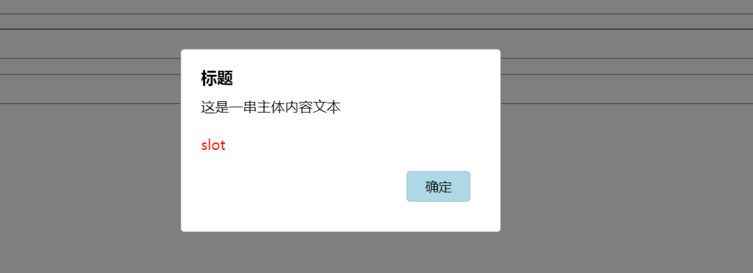
UI效果
现场演示
演示代码如下:
vue
<!--在vitepress中的.md文件中直接引入下面的代码-->
<div>
  <p style="margin:0;" id="usetomodal">这是插槽内容,可以是任何 HTML。</p>
  <button @click="show" style="border:1px solid #999;padding:10px 20px;margin:6px;">
    点我弹出 Toast
  </button>
</div>

<script setup>
	import { init,showToast } from 'axue';
    init()
    const show = () => {
      	const rawNode = document.getElementById('usetomodal');
        const slotContent = rawNode.cloneNode(true); // 深拷贝节点内容,避免节点被转移走
        showToast.send({
            title: "axue toast!",
            slot: slotContent,
            confirmText: "ok",
            onConfirm: () => {
              console.log("用户点击确认按钮");
              showToast.close(); // 关闭弹框
            }
       });
    };
</script>
二、使用方式
调起模态框
JavaScript
//导入
import {showToast} from "axue";

//准备插槽节点
const rawNode = document.getElementById('usetomodal');  //获取动态节点
const slotContent = rawNode.cloneNode(true); // 深拷贝节点内容

/**
    除了文本信息,默认只显示一个确认按钮,监听回调
    由于插槽可能要求弹框不要关闭,因此,点击button默认不会自动关闭弹框
*/
showToast.send({
    title: "axue欢迎你!",
    slot:  slotContent,
    confirmText:"知道了",
    onConfirm:function (){
        console.log("用户点击确认按钮")
        showToast.close()       //主动关闭弹框
    } ,
    //可以显示取消按钮
    isShowCancel:ture,
    cancelText:"不去",
    onCancel:cancel,
})
function cancel(){
    console.log("用户点击取消")
    showToast.close()
}
主动关闭
注意,showToast要求开发者主动调用关闭接口
JavaScript
/**
    关闭场景:
    1. 从外围逻辑或者slot内部主动关闭
    2. confirm和cancel按钮不会自动调用,主要为了保持最高的自由度
*/
showToast.close()
其他说明
- slot最终会插入在message和buttons之间
- 作为不默认支持自动关闭的补偿,用户右击可以快捷退出模态
参数项
| 内联属性 | 说明 | 类型 | 默认值 |
|---|---|---|---|
| title | 提示标题 | string | "" |
| message | 提示文本,最多320字符 | string | "" |
| slot | 插槽内容,高级自定义能力 | htmlNode或模板字符串 | null |
| confirmText | 确认按钮文本 | string | "确认" |
| onConfirm | 用户点击确认按钮的回调 | function | null |
| isShowCancel | 是否显示取消按钮,默认只显示确认按钮 | bool | false |
| cancelText | 取消按钮文本 | string | "取消" |
| onCancel | 用户点击取消按钮的回调 | function | null |