ligh-light
一、场景和形态
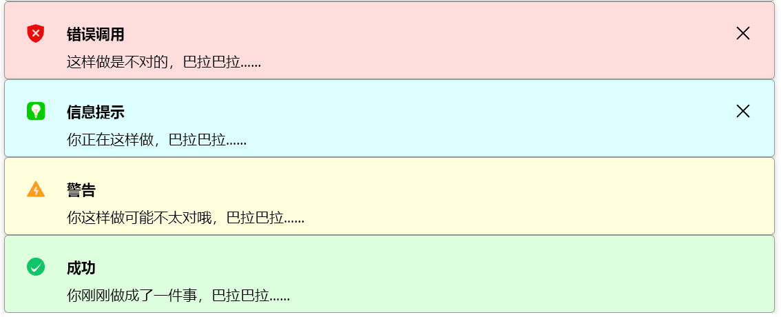
占据100%宽度的高亮提示块,用于着重提示,嵌入在html文档结构中,并支持主动点击隐藏。一般放置在某个内容的上方。
现场演示
下面的警告框可以直接×掉
演示代码如下:
html
<!--在vitepress中的.md文件中直接引入下面的代码-->
<div id="container"></div>

<!--这里采用更清爽的异步处理-->
<script setup>
	// 避免 SSR 报错:只在浏览器中执行
  	if (typeof window !== 'undefined') {
      import('axue').then(() => {
        const componentName = 'axue-high-light'
        const el = document.createElement(componentName);
        el.args = {
          type: 'warning',
          title: '警告',
          content: '这样做可能不太对哦,巴拉巴拉......',
          hasClose: true
        };
        document.getElementById('container')?.appendChild(el);
      });
    }
</script>
或者更简单的使用
html
<axue-high-light></axue-high-light>二、使用方式
定义属性参数
js
let args={
        type:"error",
        title:"错误调用",
        content:"这样做是不对的,巴拉巴拉......",
        hasClose:true
    }
使用组件
HTML
<axue-high-light .args=${args} ></axue-high-light>属性项
| 内联属性 | 说明 | 类型 | 默认值 |
|---|---|---|---|
| type | warning、info、error、success标准组合 | string | "info" |
| title | 提示标题,优先与图标齐平 | string | "" |
| content | 提示内容,如无将不占行位 | string | "" |
| hasClose | 是否显示关闭图标 | bool | false |